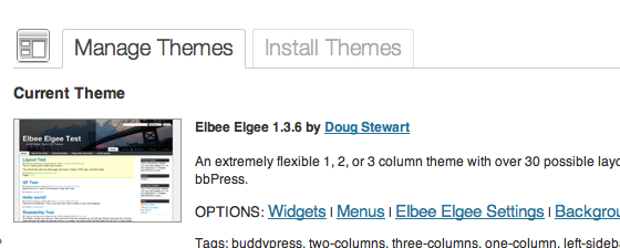
I’m slowly working my way into making Elbee Elgee into a releasable theme and I’ve been merrily plinking away on my MacBook Pro, validating the look and feel in Opera, Safari and Firefox. However, I’ve also been trying to verify it using Internet Explorer while at work and have been driven to distraction by IE’s broken box model and hideous “float:” handling.
I’ve based my three generalized image handling CSS classes on K2‘s since I used it extensively in the past and thus have a lot of posts with “class=’alignright'”, etc., hardcoded into them. I (naively, it seems) thought that K2 had IE behavior down, which apparently is just about the furthest thing from the truth. Stock K2 looks pretty funky in IE, I have to say.
So here’s my quandary: I really, really want my .alignright, .alignleft and .center image classes to work in IE as well as they do in Opera, Safari and Firefox. When I set an image to .alignright, I expect to see the following:

In IE, the text smooshes up against the image and is visible behind the padding and border on the image.
When I set an image to .center, I expect this:

Instead, “centered” images are mashed up against the left side of the story body with the left border and padding cut off.
So all y’all web designers out there, help a fellow traveler out. My base CSS file is available here (just so you don’t have to do a “View Source…” to get it). I know the fix has to be a simple, stupid one that I’m missing, but I’ve kind of exhausted all the tricks I know.


