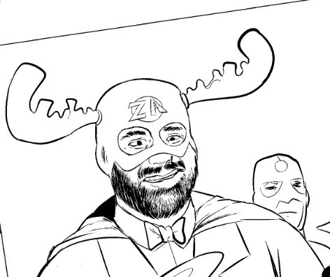
Regular readers will no doubt have noticed that this site is undergoing some visual changes. I had grown tired of the old look and thus am undertaking a bit of a rehabbing. There are all sorts of nits to fix (the archives page doesn’t work correctly, for instance) and I felt that I needed some inspiration.
While the code underlying the site is still going to be the Elbee theme I have been working on (forever!), you should notice a bunch of different visual tweaks to that code in the coming days and weeks. I’m by no means wedded to the black and white, high contrast look, but I felt that I needed to strip the site down to its essential visual “bones” and then add things back in, give myself a chance to figure out what works, what doesn’t, what needs to stay, what needs to go, etc.
So, thanks again for your patience and I’d love any feedback you might have on the subject.
One comment
Comments are closed.


I like the new header with the sharp B&W LB. Also props on the skanker in the corner!