I’m experimenting with allowing for custom stylesheets in Elbee Elgee, so don’t be alarmed by the current style. It’s still the same back-end code with a nice ode to the superlative Tarski thrown in for good measure. I’ll likely head back to the blue style in a couple of days, but I would appreciate comments, etc. from you all. Let me know how you think the redesign is coming along, what features you’d like to see, etc. and I’ll see what I can do.
Thanks.
Showin’ Off A Bit

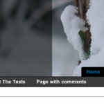

Personally, I like the white background much better than the navy blue. The blue seems too dark and bleak.
I also like the neighboring sidebar columns, but the fact that one is so much longer than the other bugs me.
I’ve also decided that I don’t like big banners at the top of blogs. Even though I’m still guilty of this myself, I decided that something that provides so little content should not receive so much screen space. That’s something I’ve tried to work in at the Sporting Gnomes even if I do destroy the effect somewhat with the extra GoogleAds.
I’ve been working on the sidebars – I need to clean up my blogroll, for one, and I have more content to add to the other. Hopefully those will even out.
I tried to go for a much-reduced banner a while ago and received negative reactions from many corners (Brad and my wife were two of ’em).
Thanks for the insights, though. They definitely help.